
December 31, 2009
November 28, 2009
Psalm 23

I don't know what it is about being half asleep in the morning, but it seems to be when I get ideas. One morning I saw a picture in my mind of the 23rd Psalm. The painting was 3-d with a mountain range and in the middle was a red line signifying the "Valley of death". As I thought more about it and the actual scripture, I realized it shouldn't be red, but gold. It is within the valley of death that we are called not to fear and know that God is with us. We are not alone during those times. In fact, that's when He is closest to us.
November 21, 2009

November 16, 2009
Another Tree... I guess I like them
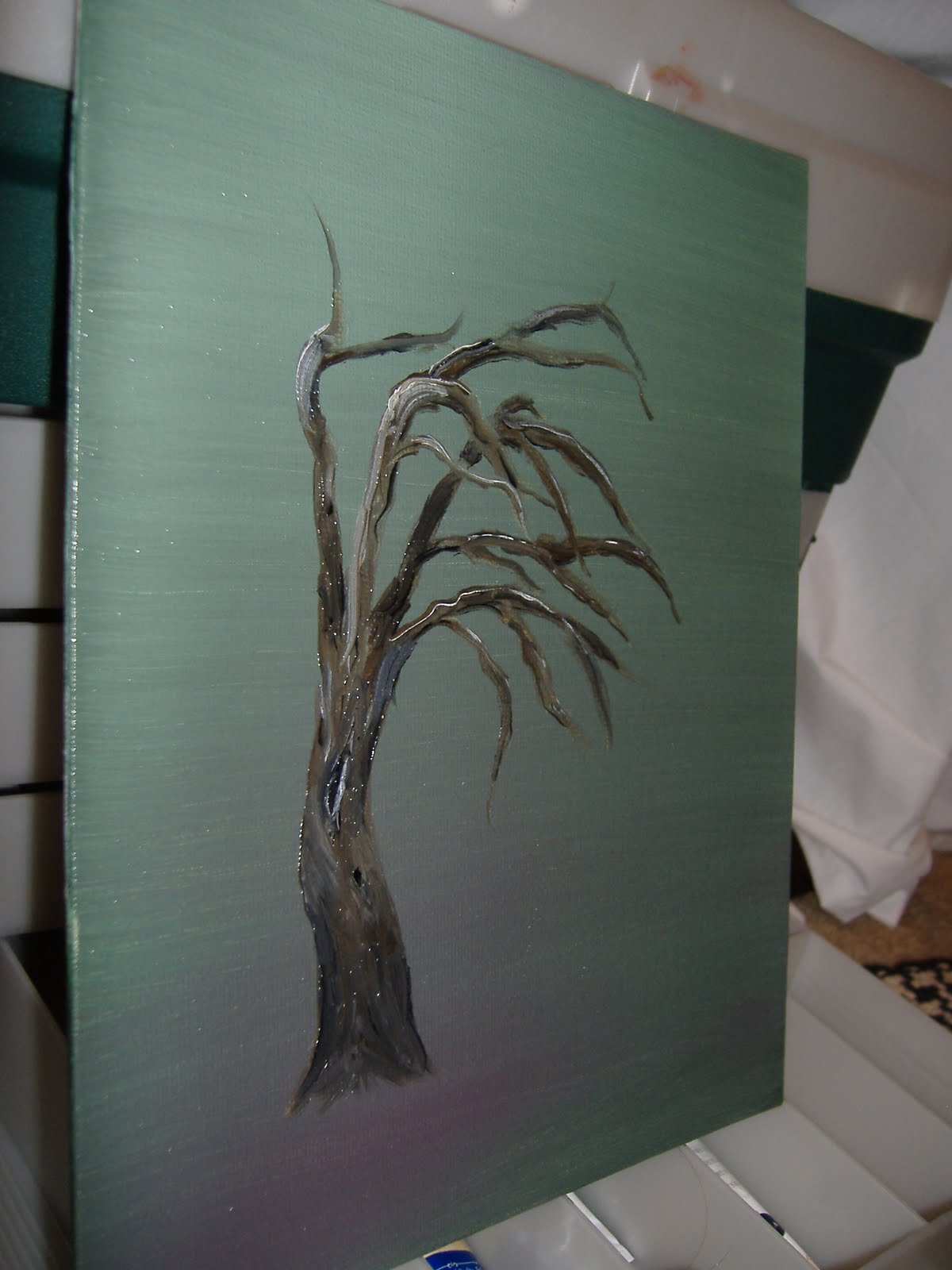
So I made the background first and for about 5 minutes just stared at it to see what picture would pop out of it. It looked like it needed a tree leaning to one side. I was going to do a tree getting blown by the wind, but as I started painting an old tree started forming. I completed this one in about an hour.
I've been drawn to painting trees recently. I've noticed artists like to paint (or photograph) the same thing in different ways. I saw a documentary on this photographer, Sally Mann, after she had done a series on a dog bone. She said that the art critiques kept trying to figure out the deeper meaning behind the use of the dog bone.
Sally said it was because she liked it.
October 15, 2009
I Dream of Birch Trees
I had the idea for this painting when I was half asleep one morning. I saw white birch trees on a hazy background. I really like how this turned out. Props to Brent for the idea of expanding the trees across the canvas. 

I'd like to do more of this type of painting and experiment with different color backgrounds.
September 20, 2009

September 19, 2009
Remember Bob Ross?
 When I was younger I used to watch Bob Ross on PBS paint. I was facinated by how he could paint a whole landscape in 30 minutes. Well at Michaels today I saw that he (or whoever has taken his name) has "how to" books. So I bought one and painted this. It takes you though each step so you can learn new techniques of painting landscapes.
So I'm sure you'll see more of these types of paintings soon.
September 15, 2009
The Beach and the Flowers


So I decided that just because I'm not taking my art class doesn't mean that I can't use my oil paints (even though technically I don't know how to use them). The Flower Pitcher I just did off the top of my head. Did a quick sketch and started painting with lots of red. There is red in every area of the painting (even the blue).
The Beach is from a picture I took while on the Gulf of Florida. I really should have added more red to this painting to warm it up.
Again, my camara makes the colors look a little different and there's a flash, which is why they are at odd angles.
August 5, 2009
Dawn the Duck
 So I've started using a new medium - colored pencils. Painting takes a lot of setup and cleanup to the point that it keeps me from painting more often.
I found this duck in a Dawn Dish Soap ad in a magazine. This is my first colored pencil foray and I really like it. I'll have to experiment with the different softness of pencils to get the right depth of shading.
Making something fuzzy is actually really hard. Too many lines and it can look harsh, not enough lines and there won't be any depth to it. I'm sure there is a technique to creating fuzz with pencils.
April 29, 2009

April 4, 2009
Updated Apple Painting

Here are two simi-completed apples. My teacher saw my progress and said I'm ready to use brown in my apples to make them more realistic.
March 28, 2009
Curmudgeon the Squirrel and 1st Painting
 So this is Curmudgeon the Squirrel. Why I choose the name Curmudgeon, I don't know, it popped into my head as I was drawing him. To me it's ironic, because he's not curmudgeous at all. Quite cute, actually.
 Here is my progroess on my Apple painting. You can see how I'm making an apple look round with different shades of red, orange and blue. Blue? Yes, there is blue on the dark side of the apple. It's interesting to learn about color theory. You don't just add black to a color to make it darker. On the light side of the apple it goes from white, yellow-white, yellow-orange, orange, orange-red, red, pure red. On the dark side of the apple it's red - dark red, and then adding in an increasing amount of a purple-blue.
10 more Apples to go!

March 9, 2009
Apple sketch - 1st painting
 This is my sketch of the apples I will be painting.
Artists do (well they are supposed to) multiple sketches to "study" a painting. It's to help show the shading, focus, messaging. Sometimes you'll create a color study to see which colors will evoke the message you want or which colors will go best together. By the time you start painting you should have a very clear idea of what you're going to do. I'm finding that there's a lot of planning and preparation into painting one picture. Just when you thought artists were a bunch of spontaneous paint splashers.....
February 13, 2009
The Prodigal Son

This is from Rembrandt's "The Prodigal Son". The goal here was not to draw the whole picture but just the areas that you want the viewer to look at. When you look at Rembrandt's painting your eye immediately goes to the father's face first. This is done through contrast. There is the greatest amount of contrast around the father's face so your eye is lead there. Then it goes to the son's feet, the father's hands and then to the older brother. Each area has to have less contrast then the next. So if you want to have the feet stand out second, you make it have less contrast than the father's face, but more than the father's hands.
The reason behind creating focal points is so that you can tell a story. What message are you trying to get across? What feelings do you want the viewer to experience? Rembrandt wanted you to experience the father's love for his son that turned away from him. You see his face looking at his son. Then you see the son's feet and that his shoes are falling apart, he has nothing. Then you look at the hands of the father. One of the father's hands is gentle and the other is pulling the son toward him. The older brother has crossed arms and a stick as if standing back in judgement.
January 31, 2009
Weeping Girl and Christmas Card drawing

This is The Weeping Russian Girl by Pietro Rotari. Well she turned out more "Roman" than "Russian". I had a hard time griding the picture so her face turned out longer than it should have been. In art class we're given xerox's of paintings that a lot of times are already grided out which makes it hard to measure the picture out yourself. I'm really happy with how her hair piece turned out. It has the right shading and is pretty realistic.
Griding - Majority of artists do not just start to draw free-hand, they do something called griding. When you grid you basically create squares over the whole picture (or a grid) and draw what is within the squares. This way you can take a large picture and make it small or vice versa.
I have one more drawing, "The Prodigal Son" and then I'm on to painting.

For those that didn't catch it, the Christmas card I sent out was my drawing.
Subscribe to:
Comments (Atom)